-
This is a reminder of 3 IMPORTANT RULES:
1- External self-promotion websites or apps are NOT allowed here, like Discord/Twitter/Patreon/etc.
2- Do NOT post in other languages. English-only.
3- Crack/Warez/Piracy talk is NOT allowed.
Breaking any of the above rules will result in your messages being deleted and you will be banned upon repetition.
Please, stop by this thread SoccerGaming Forum Rules And Guidelines and make sure you read and understand our policies.
Thank you!
You are using an out of date browser. It may not display this or other websites correctly.
You should upgrade or use an alternative browser.
You should upgrade or use an alternative browser.
ChAnC3 kits
- Thread starter ChAnC3
- Start date
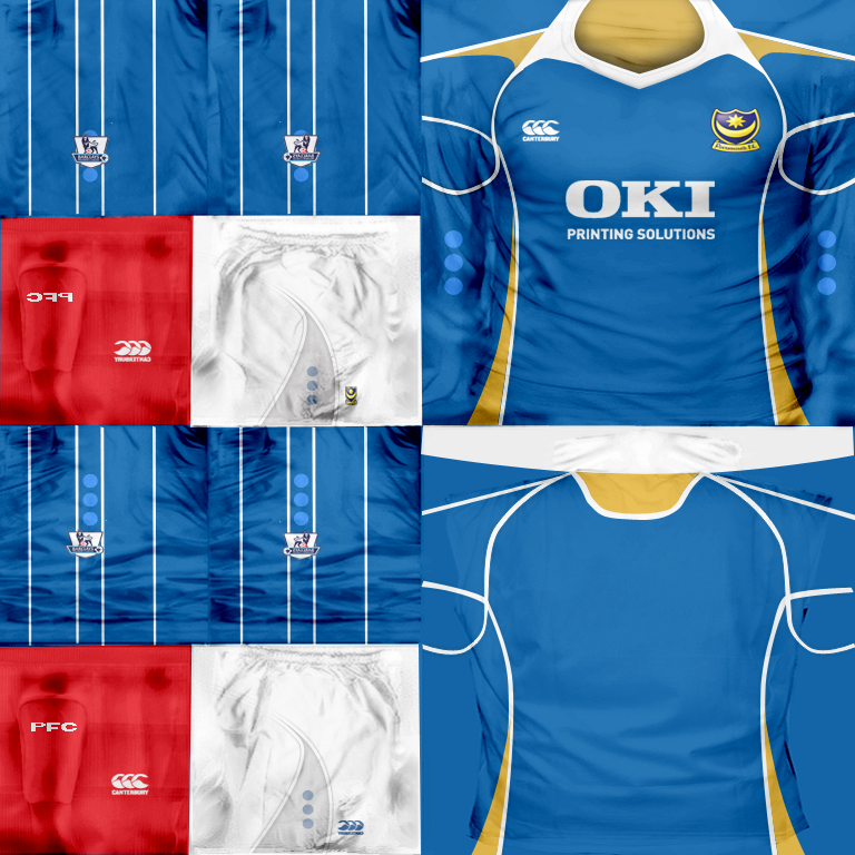
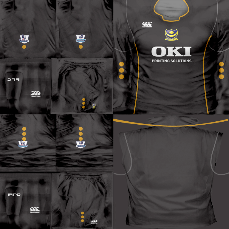
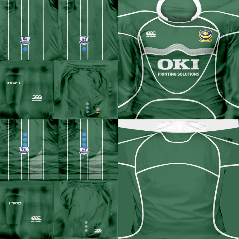
10Ruud;2364171 said:Portsmouth are good...but a couple things.... The little yellow part on the back at the top of the home and away comes down to far and doesnt let the name fit quite right...on the GK the top 2 lines on the back are too close together, which doesn't allow the name to fit properly..and yea the Premieship badges would be cool.
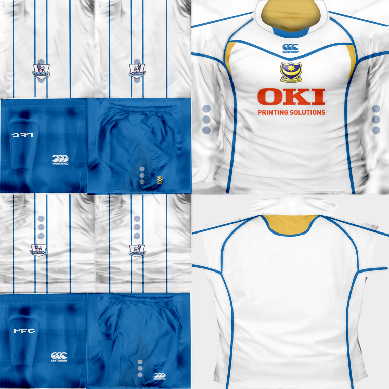
Portsmouth updates:

")
")
Fernandito
Club Supporter
Nice Portsmouth kits mate 
Biebrich 02
Senior Squad
what??? resizing changes colours in NO way. absolutely never ever in absolutely no possible or impossible way.
Tizmo;2366008 said:Hmm, I seem to have the same problem as beekolme. Whenever I resize kits that have got red to 1G, the red just becomes way too bright. And ideas?
same happens to me, but i don't even resize them
take a look at my post a couple of pages back
only happens with his kits, but in the game / photoshop they look awesome
That's strange that it only happens with his kits.SlowHand;2366086 said:same happens to me, but i don't even resize them
take a look at my post a couple of pages back
only happens with his kits, but in the game / photoshop they look awesome

")
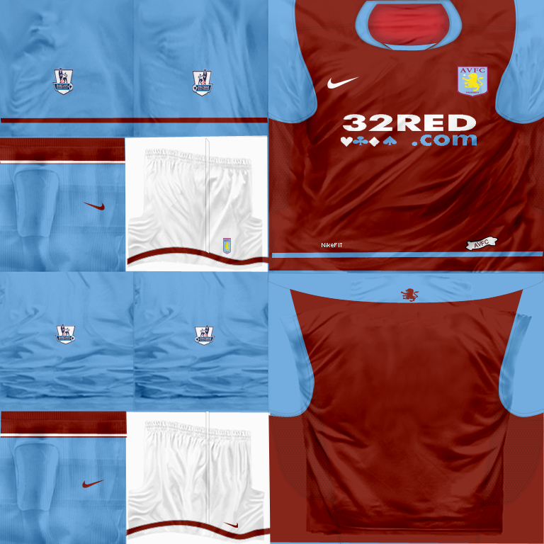
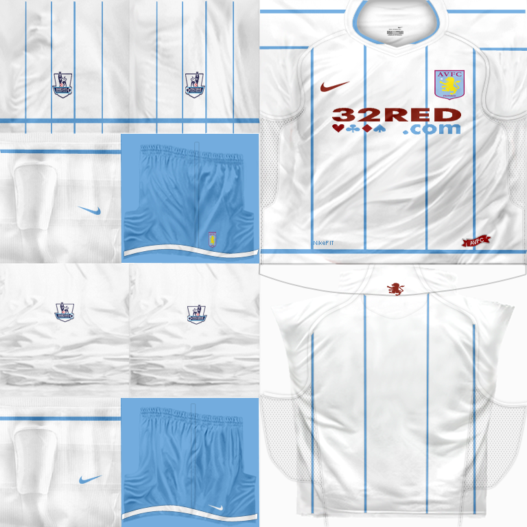
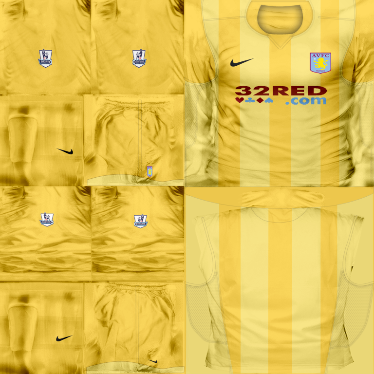
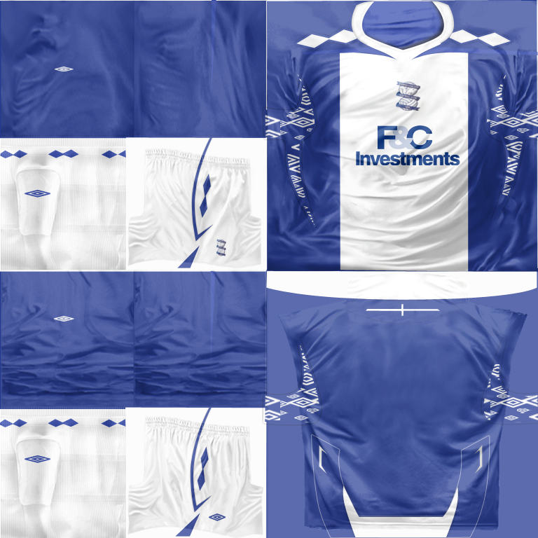
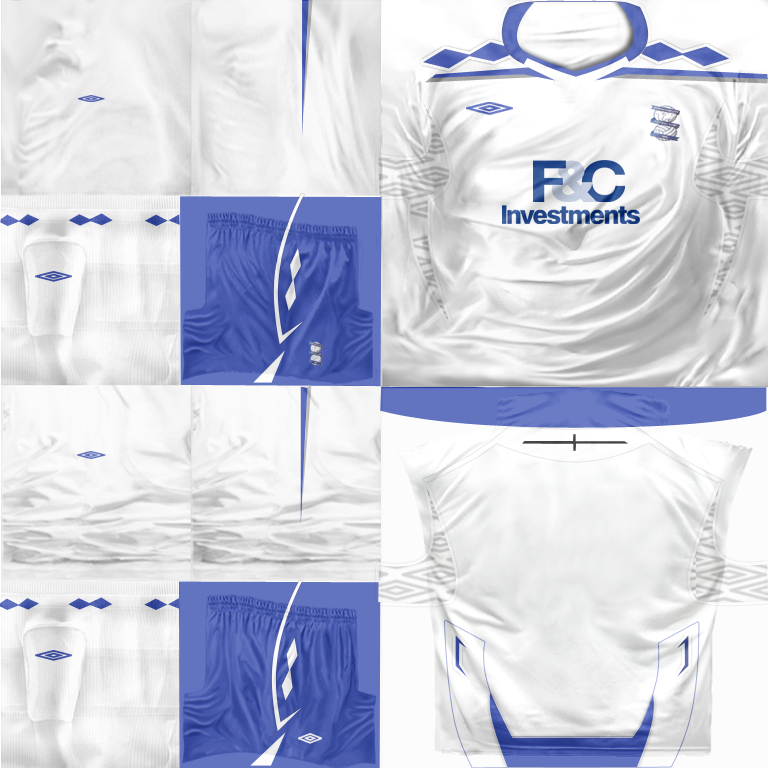
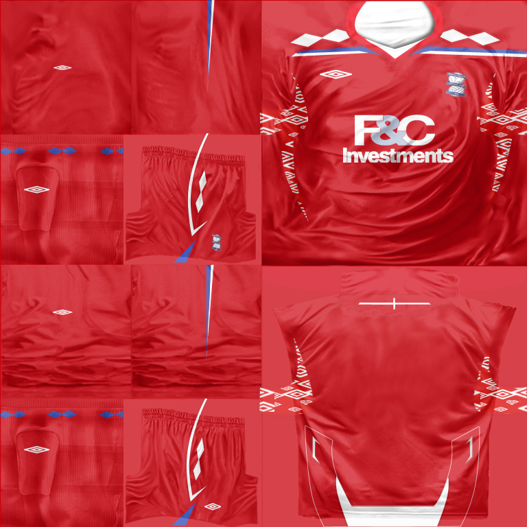
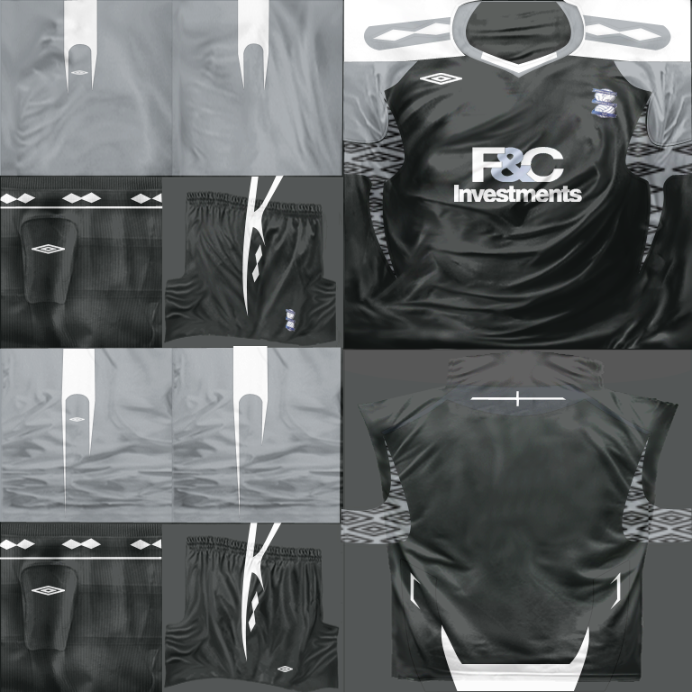
ChAnC3;2355632 said:birmingham home/away/third/gk:
Can anyone re-upload these kits please ?