French shirt is a total disaster. Greece's is beyond the lowest point. I am fed up with Adidas's rubbish crap year after year. WHAT THE HELL ARE THEY THINKING? Who are designers? Look at those 2 eye gouching lines coming from the shoulder and on the bottom of the shirt. WTF !!?! Who makes this crap? Better yet, who accepts it? This mindless "work of art" would take me 5 min to design, and 4 of those minutes would take me to find a coloring pencis. It-is-atrocious! However makes my day since Greece is my country's WC2010 Qualification Play-Off opponent, yet at the same time scares me because Ukraine is being sponsored by Adidas as well... So is FC Dynamo Kyiv... oh please have mercy.
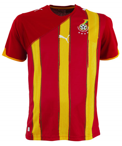
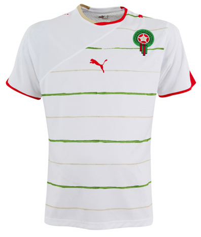
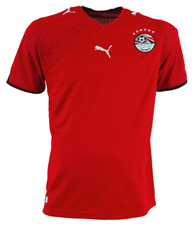
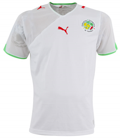
Puma, meanwhile, is a pure joyfull roller coaster. In couple of years Puma climbed from the bottom of a dwell to it's very top, while all Adidas have left is the 3 stripes. ""Oh look, official 3 stripes suck on this!". My only complaint is with Puma logo being in the middle. I hate that! (Adidas is blasting in that department too... No brainer). Team's logo should be on the heart side, logo of a firm on the opposite. Not the middle! But, it is unreasonable to bash such a beauty by a logo position. Good work Puma! Boooooooo Adidas, highlight of their products was 2001-2005, every other year was sinkable.