
Pogba4Now
Team Captain
King of the Kop;3777404 said:Well its not as bad as this....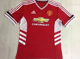
Bobby;3777805 said:God I hope that United kit is real.
Snake Plisken;3778581 said:Reported as fake by a source on a Manchester United fans' forum who has been 100% accurate regarding new kit designs with several years. The stripes running the full length of the sleeves made me suspicious, been a while since adidas did that.
In your face!

")


 Now this looks quite retro in my opinion.


