• This is a reminder of 3 IMPORTANT RULES:

    1- External self-promotion websites or apps are NOT allowed here, like Discord/Twitter/Patreon/etc.

    2- Do NOT post in other languages. English-only.

    3- Crack/Warez/Piracy talk is NOT allowed.

    Breaking any of the above rules will result in your messages being deleted and you will be banned upon repetition.

    Please, stop by this thread SoccerGaming Forum Rules And Guidelines and make sure you read and understand our policies.

    Thank you!

New Kits 2007/2008

Interista13

Starting XI
Sevillista;2463592 said:
At least Puma isn't desecrating their jersies with unnecessary lines, stripes, etc. Although they share the same templates, each jersey is pure class.

what class? Yes, some do look very nice like Italy but I dislike the fact that they are very unimaginative. It's just a color shirt with a different color collar and the team's badge...there is nothing that makes a ceratin team kit unique...sort of like the old Puma watermarks...
 

easyeasyeasy

Senior Squad
KaTo;2463419 said:
Has anybody got pictures of the new France goalkeeper shirt, or wasn't it released yet?

KaTo
 

Sevillista

Starting XI
Interista13;2463665 said:
what class? Yes, some do look very nice like Italy but I dislike the fact that they are very unimaginative. It's just a color shirt with a different color collar and the team's badge...there is nothing that makes a ceratin team kit unique...sort of like the old Puma watermarks...
Most would consider a "class" kit to be simple and traditional. If the folks over at forossevillagrande.com had their way, Sevilla would wear a plain white jersey with the badge over the heart, and nothing more.

Personally, I prefer jerseys to be jazzed up just a bit, but these kits are definitely classy.
 

MikeyM

Big Daddy
Sevillista;2464157 said:
Most would consider a "class" kit to be simple and traditional. If the folks over at forossevillagrande.com had their way, Sevilla would wear a plain white jersey with the badge over the heart, and nothing more.

Personally, I prefer jerseys to be jazzed up just a bit, but these kits are definitely classy.

I agree with the idea that kits need a little design / trim to set them off. But there is a difference between doing it with a bit of class and wrecking it. Puma recently seem to have hit the right balance IMO. Nike's recent designs have been fairly minimalist too.
 

easyeasyeasy

Senior Squad
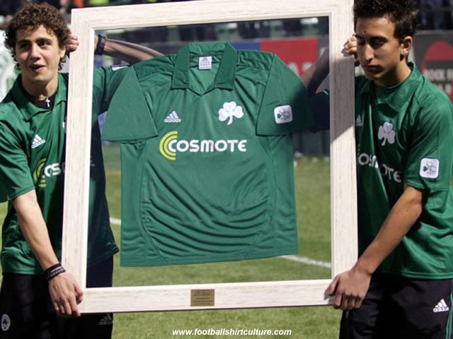
Panathinaikos centenary shirt


Two things about this - firstly I noticed that the design looks like an Adidas design from 06/07 but with no contrasting trim, and secondly, the guy on the right holding the frame looks like he's half asleep! (H)
 

easyeasyeasy

Senior Squad
I know this thread is for 07/08 kits but Crystal Palace have already put what they'll be wearing for 08/09 to the public vote...


Interestingly the home kit is between the familiar stripes and the classic home kit of the late 70's/early 80's, whilst one of the away kits is based on another they wore in 1981 (quite similar to Arsenal de Sarandí of Argentina).

I know there's only four choices, but other clubs have conducted similar votes each season, get the fans actively involved by letting them choose the kit they would most like to see their heroes wear. It's something you very rarely see top flight sides do (I think Middlesbrough must be the only one who did) because of their multi-million pound kit sponsorship deals - I mean, how often have we seen teams turn out in kits that have been universally derided for one reason or another, such as lack of tradition, ugly design, and so on?
 

Interista13

Starting XI
Oh dear God, that Mexico GK seriously blinded me for a few seconds...why must it be soo fugly??? IMO

I kind of like that Pananthinaikos shirt...it is veeery vintage...a nice job by Adidas. Easyeasyeasy, I agree mate, it really does look like the 06/07 design!

About Crystal Palace...I personally like Home A and Away A....
 

easyeasyeasy

Senior Squad
That colour scheme of the Mexican away keeper jersey kinda reminds me of the Jorge Campos era, the old eyeball searing combination of fluorescent colours, only, not as near as outlandish. (H)

Anyway this is mad and I might be accused of being an eagle-eyed pedant, but I couldn't help but notice the one small minor detail that Erreà have got wrong with the Home B choice for the new Crystal Palace kit. Have a look at this page and scroll down to the home kits from the late 70's, early 80's, particularly the 77-80 kit - they certainly haven't done their homework on the front sash design, it's red on top of blue, not the other way around. :evil:


Top